HANDL - WELLNESS APP PROJECT
Brief: For the 5th week of the Ironhack course I was challenged to come up with a wellness app
Process:
• Research: Survey, interviews, Persona, User Journey, Affinity Map, Moscow Feature Prioritization, Visual identity competitive analysis
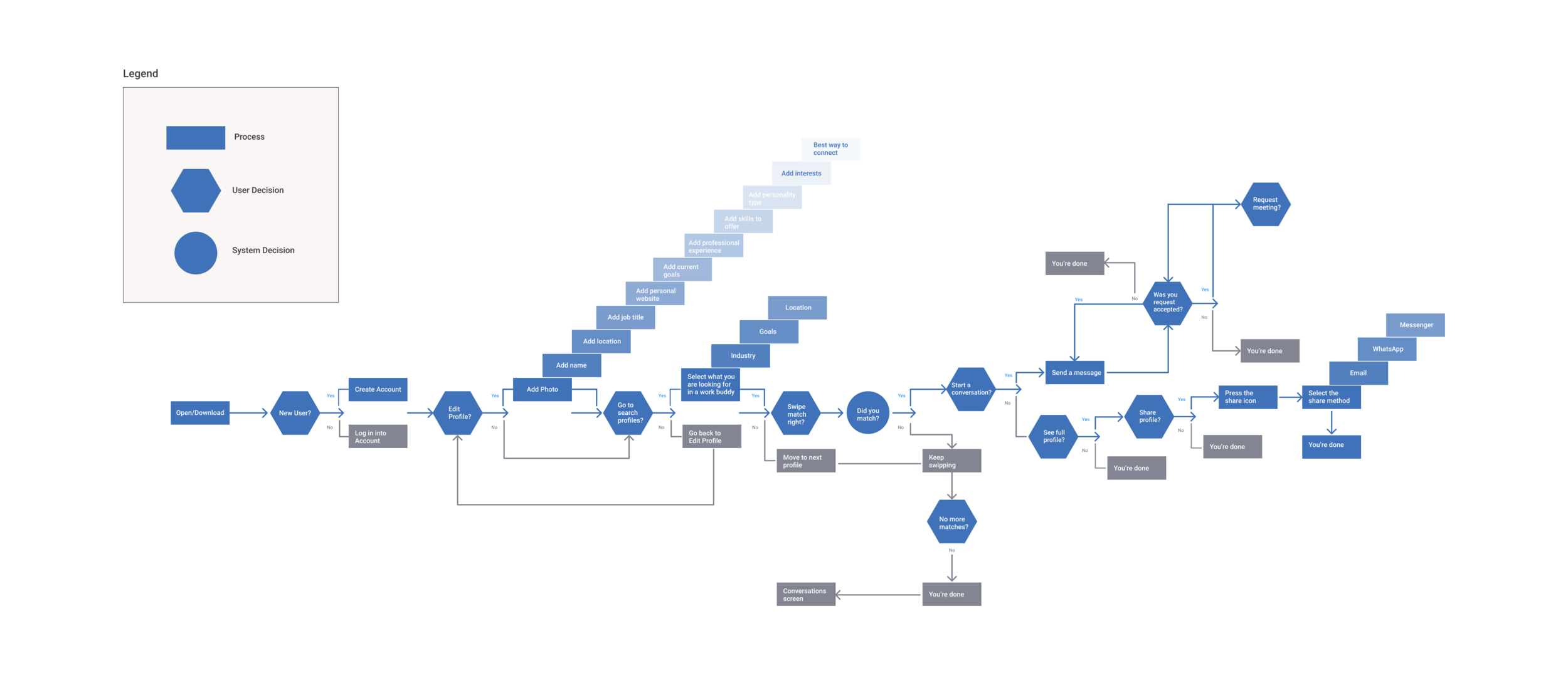
• Ideate: Sitemap, User Flow, Moodboard, Brand identity, Style guide
• Prototype: Lo-fi & Hi-fi wireframes, Responsive design, Animations
Software: Figma, Illustrator, Photoshop
Timeline: 9 days design sprint
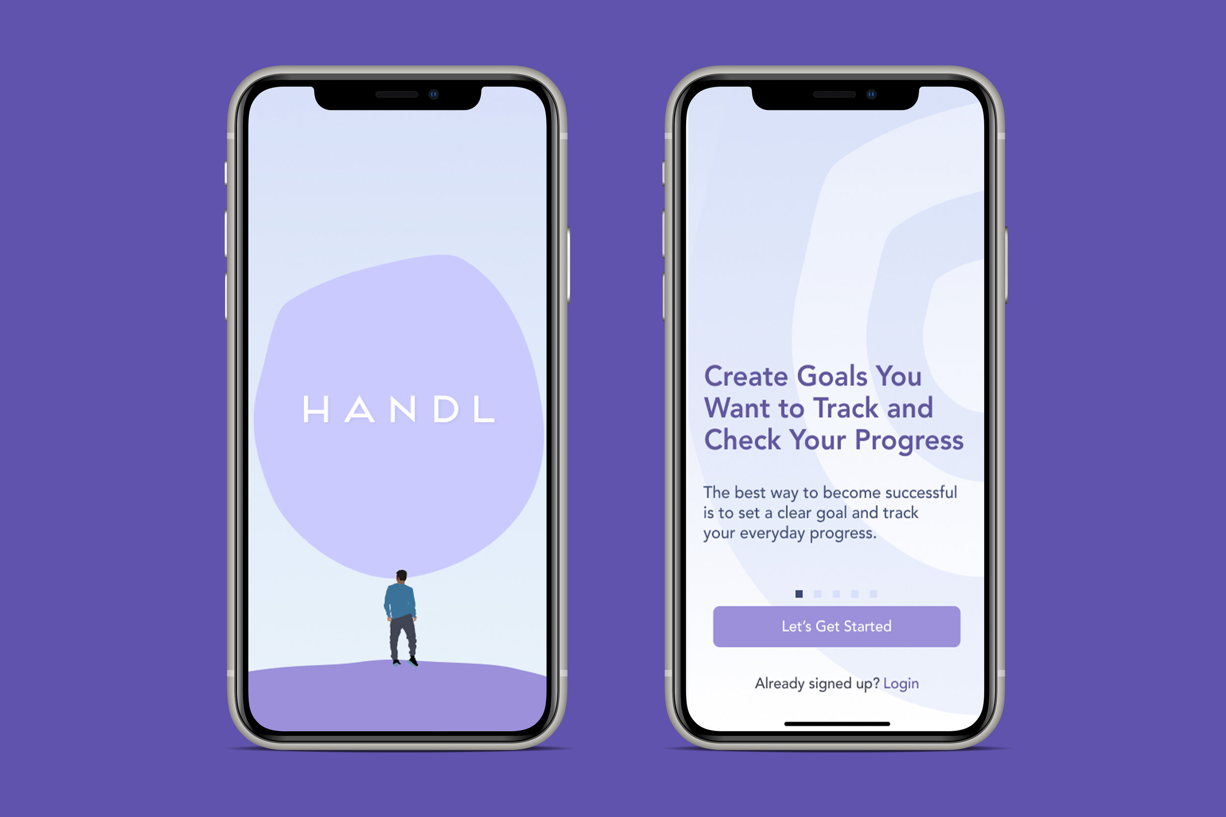
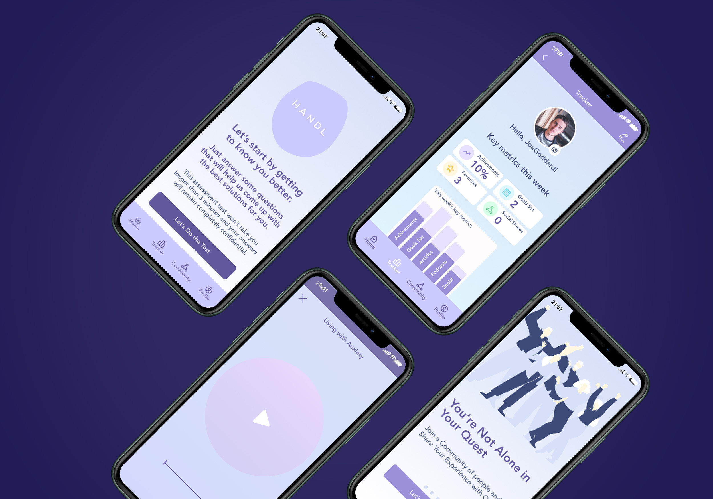
Handl is an app that helps to ease anxiety symptoms offering the user a custom library of science-based articles, podcasts, relaxing games, a goals tracking system to boost self-confidence and access to a community of like-minded people.
Research
I’ve started the project by doing a survey and collecting every bit of information that I could to find about how people deal with anxiety disorders and found out that everyone suffers or has felt some level of anxiety in their lives. Through user interviews, I’ve confirmed that men and women have different ways to express it.
My research led me to my problem statement: Men need to find a way to embrace their vulnerability in asking for help in order to heal their anxiety disorders.
Ideation
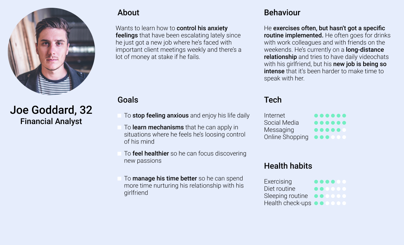
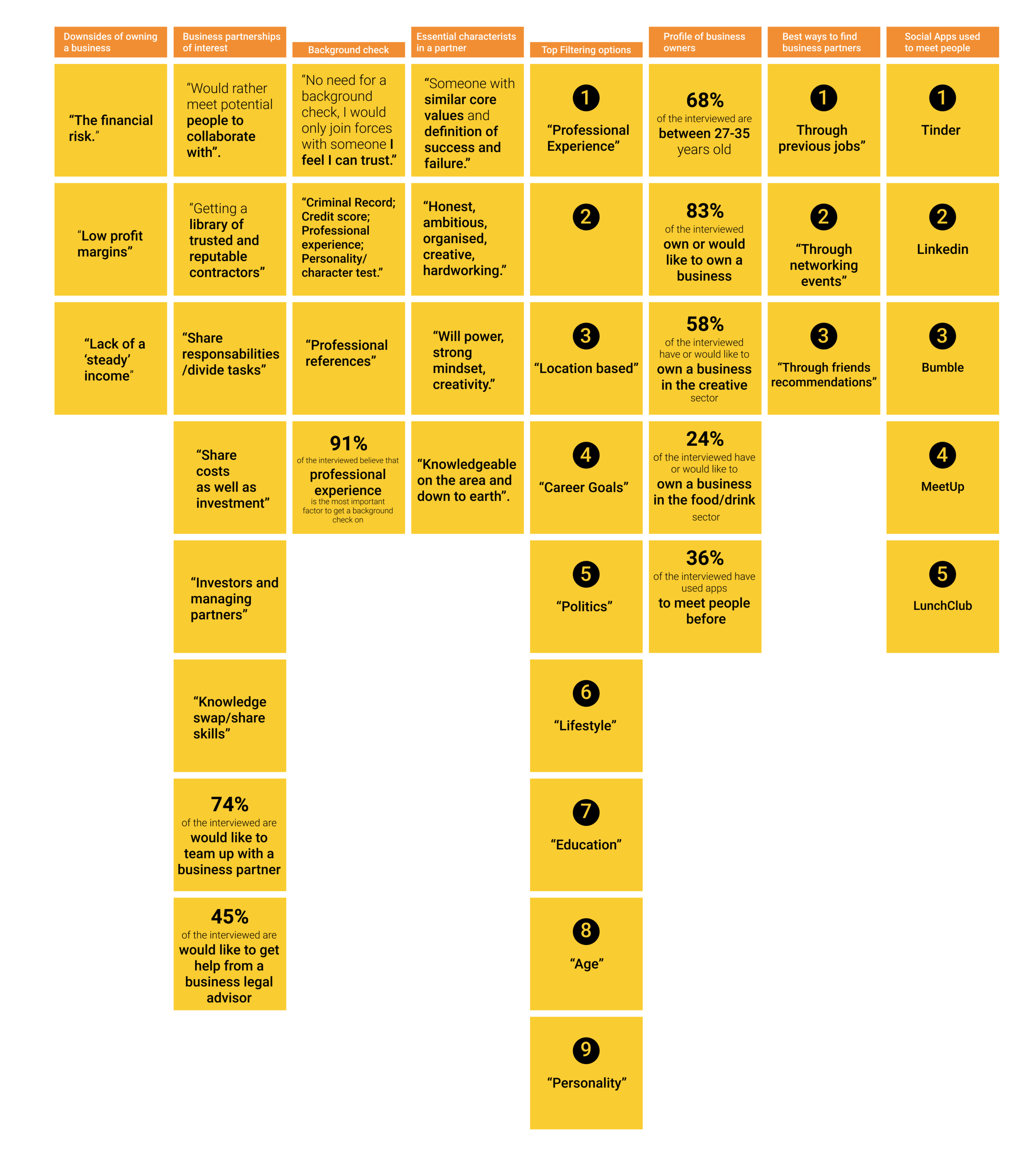
I then worked on doing an Affinity Map to help me cluster the information that I’ve gathered in the quantitative and qualitative research in one board, so it would help me create my user persona lifestyle profile and goals.
Joe Goddard is a 32 years old, financial analyst, who would like to learn mechanisms that would help him to control his anxiety better, to feel healthier and manage his time better - he summarises the research findings in one person.
After creating Joe, I’ve traced his emotional trajectory (User Journey) while using the current apps in the market that offer anxiety-relief methodologies and this helped me target the opportunities and touch-points to create my unique selling point.
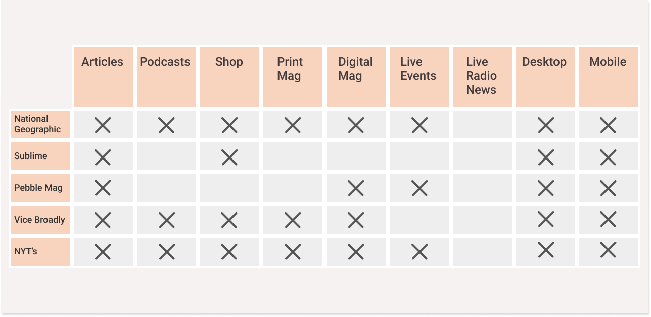
The next step taken was to do market research on the features and look & feel of existing apps that offer help with anxiety. This helped me to get inspiration for what to include and not to include in my design iterations. By using the Moscow method I was able to define an hierarchy of the features that I wanted to include on my app wireframes before jumping on defining the sitemap and sketching my mid-fi’s.
The next natural step for me was to start sketching the wireframes flow and defining what should be the user journey. After getting my first iterations, I’ve tested it with a couple users to see if the flow made sense and jumped again on the drawing board, by changing it according to the user feedback that I’ve received. I’ve repeat this process a couple times before feeling that it was time to jump on the hi-fi’s.
Design
For the naming and branding of my project I wanted it to be a simple word that would translate into a ‘helpful, friendly hand from a friend you could trust and confide’. Handl seemed perfectly appropriate and, to help explain better the message I’ve illustrated a man with a ‘burden cloud’ above his head’, using a color palette that is widely associated with feelings of anxiety. For the logo I’ve used the typeface Frontage and designed it with wide space between the letters to convey the idea of ‘breathing space’. The color palette is simple and focused on a single color with different tones.
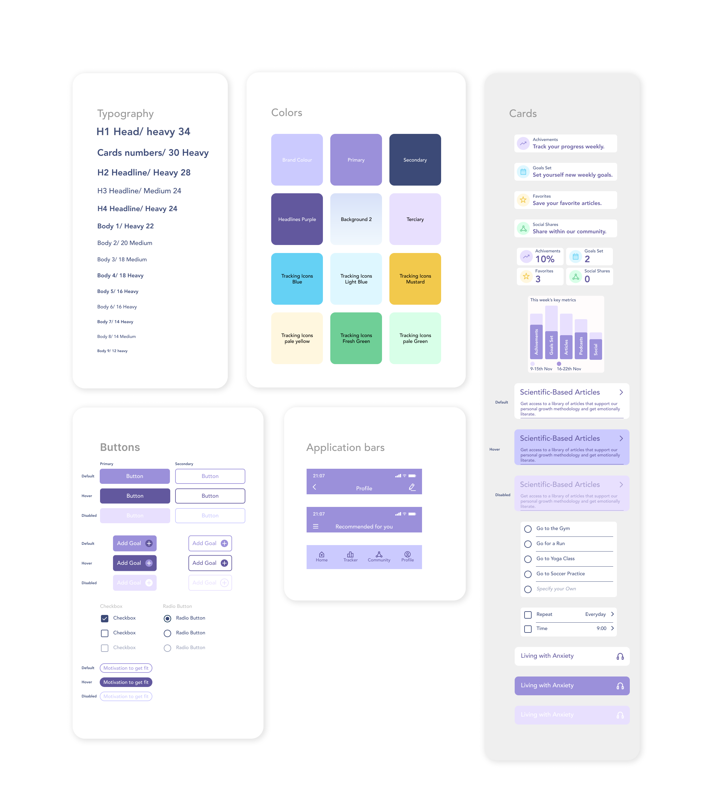
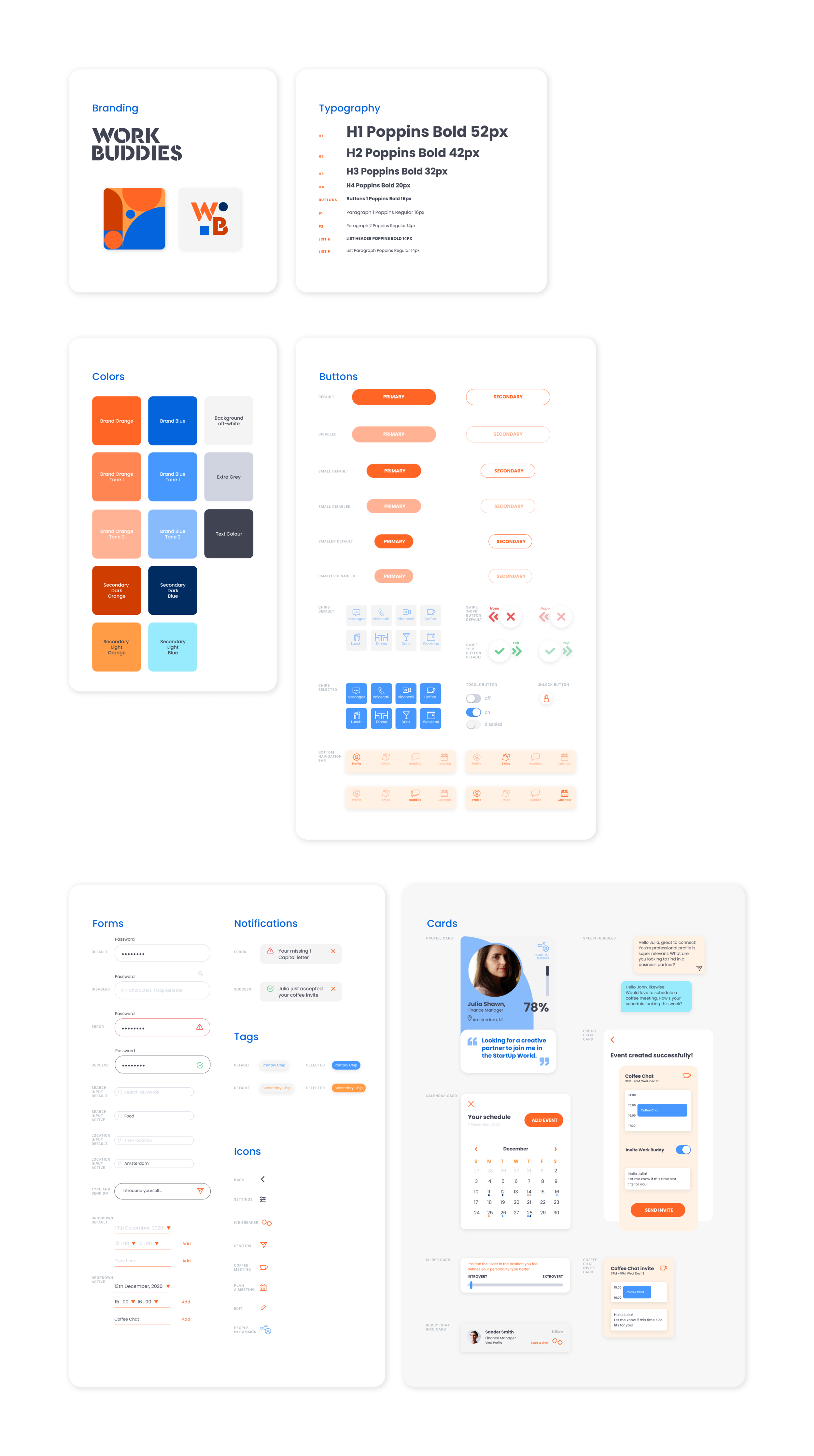
After designing the logo and selected the color palette I started designing my Hi-Fi wireframes and, at the same time, the atomic style guide. Through this process I did A/B testing to see how the look & feel of the app was regarded and made minor changes on the final prototype.
Part of the assignment was also to iterate on a desktop and android version of my application. I’ve followed the Material design principles to come up with the android version, but kept all the same color, font and style guide principles in both android and desktop versions.
Outcome
Following the UX design process led me to a product that fit my target goals expectations and thanks to usability testing and feedback I’ve made changes, added additional features and improvements to my application.
In the video demo below you can see the final outcome!
